Trybe
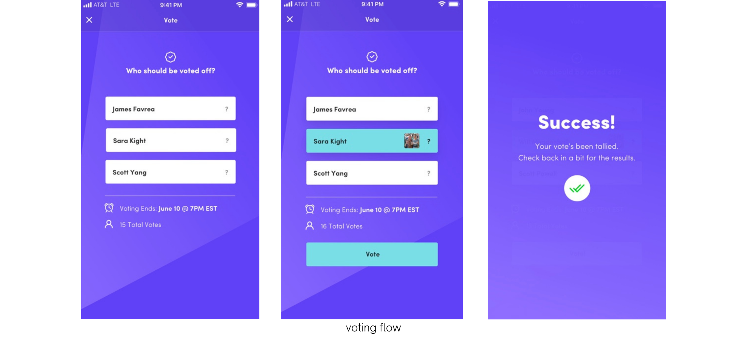
Inspired by the iconic TV show, Survivor, Trybe is an app where users virtually summon their friends to form coalitions and outperform one another at different stay-at-home challenges. Each week, after challenges are submitted, users are tasked with voting off one of their own.
I was the Lead Content Designer for this project and collaborated with the design team on a variety of product and brand needs.
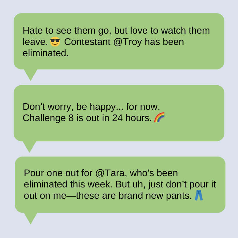
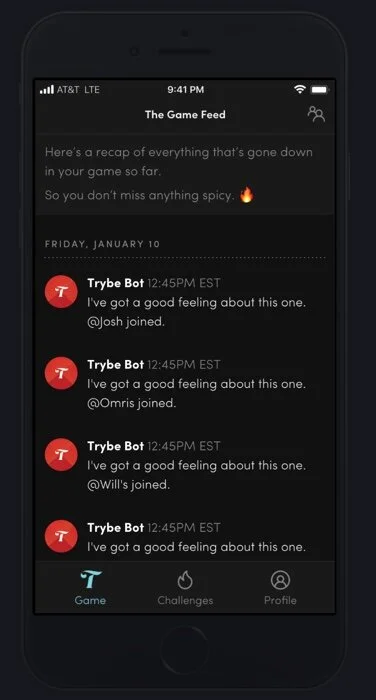
Notifications & Trybebot
Capturing voice
Trybe aims to virtually bring together friend groups through the pandemic, Ietting friends bond over playful challenges, funny videos, and dares. To capture these characteristics, I made the content punchy, engaging, and eye-catching. The use of emojis is meant to bring a pop of color to the user’s screen and draw them into what is essentially a stimulating, energetic game.
Appealing to Gen-Z
The target user of this app would be a gen-z or young millennial. In order to appeal to this demographic, I played off lyrics from trending songs on the app TikTok, a popular music and video app among this age group.
Ex:
I’m a savage… classy, bougie, a gadget…. I’m a bot that announces the ballot…. @Zoe was eliminated, what’s happenin’? 🎵😜
This notification message is a play on Megan Thee Stallion’s iconic quarantine hit, “Savage.” This song went viral on TikTok during the year 2020.
You can view all of my messages & notification samples here.
User Experience
I collaborated with the designer on this project to produce wireframes and make the user flow more intuitive. Iterations of this app dealt with several ways users could navigate the site and access their challenges, other teammates, and content.
Design Thinking
I advised the designer to remove the “Players” and “Submit” buttons in the navigation. With a page dedicated to Challenges, as it felt more pertinent to the users. After being involved in understanding the game play, it became clear that when players would be required to submit entries, that would be clear in the game flow and would be confusing to have an action that was temporary have a permanent place in the navigation. Furthermore, I advised to move the Players page up into the right-hand corner to match common patters from other apps (like GroupMe, or Instagram Direct Messages) where information & interaction between people lives.
UI Text: Buttons, CTAs, and other Components
I made edits to the Welcome page by shortening text and making the copy punchier. I incorporated parallelism between the CTA and button text (Join→Join vs. Joining→Join a game). I minimized the amount of button text, editing them down from three words to one for more immediate readability. I also pared down exclamation points to stick to the golden rule of one per page.
Below is a before-and-after, making a CTA cleaner and giving hint text some more personality.
Additional Copy
Below are some additional screens with original copy. You can also view a copy deck of Trybe Bot messages & notifications, many of which were challenge-specific and include more witty banter from the bot.


