Improving Qapital’s Onboarding
When I joined Qapital, the app had a 40+ screen onboarding that took users over 10 minutes to complete. Through user testing we were able to pinpoint the exact places that users were dropping off. From there, I strived to make the onboarding clear, concise, and convincing by slashing several screens, condensing many lines of text, and ultimately advocating to change the structure of the onboarding—moving away from a linear explanation and toward a progressive disclosure model.
A general overview of the onboarding
Qapital’s old onboarding had five major parts:
1) an intro carousel
2) sign up
3) goal creation & membership tier selection
4) LFA (link funding accounts)
5) upsells of several features that we wanted to promote (Payday Divvy, Dream Team, etc.)
In short, the onboarding had a lot going on, and was asking the user for a lot of time and attention. The cognitive load on the user was arguably gargantuan, but at the same time, Qapital is a complicated app with many features that definitely take some time to be explained. The user is not only learning how the app works, but is also learning a bit about personal finance and behavioral science along the way.
Our main question with regard to this onboarding was: How do we show everything all at once, and make sure the right features are being shown to the users who may want them? How do we do this without burdening the user with cognitive overload?
Together with a designer on my team, we led an effort to conduct user testing (both quantitative and qualitative) to find the exact painpoints where users were having trouble understanding what to do next, where users were spending lots of time, and where they were dropping off altogether. Since neither of us were experts in user testing, we were given a budget to hire an external research company (Simon & Kucher), and we ultimately used their findings to pose a solution to stakeholders as to how we were going to move forward.
User tests: main findings
We had a few main takeaways. The first was that, as we guessed, the onboarding was too long. We experienced major user dropoff when users were asked to create their first goal, so not many made it all the way to the end. There were too many choices to make on each screen, from deciding whether to start with a Savings vs. Invest Goal, to deciding which Rules to add to a Goal you just created, to deciding how much money to allocate from a paycheck across different goals.
User interviews also showed that new users couldn’t find the features they were looking for during onboarding. An investing-oriented person had no idea that Qapital offered investing with zero management fees. A married user had no idea we had a great feature for couples.
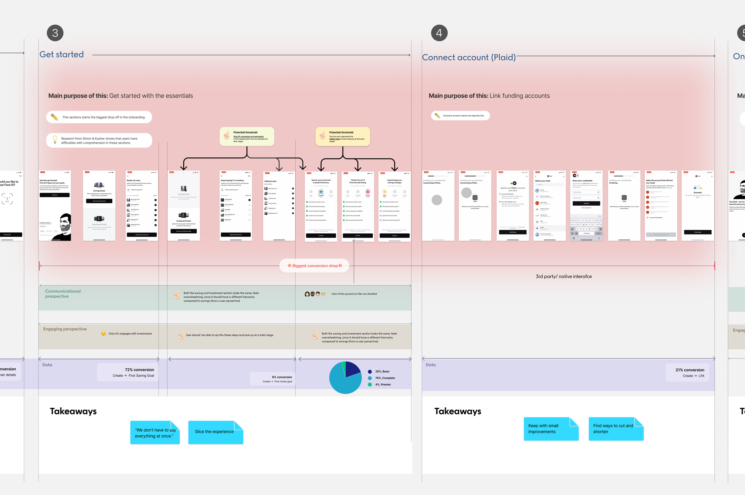
Below is an overview of everything we gathered from user tests. As you can see, the two parts of the Onboarding with the most painpoints are highlighted in red.
Breakdown of all research & key findings
A closer look at pain point areas in the Onboarding
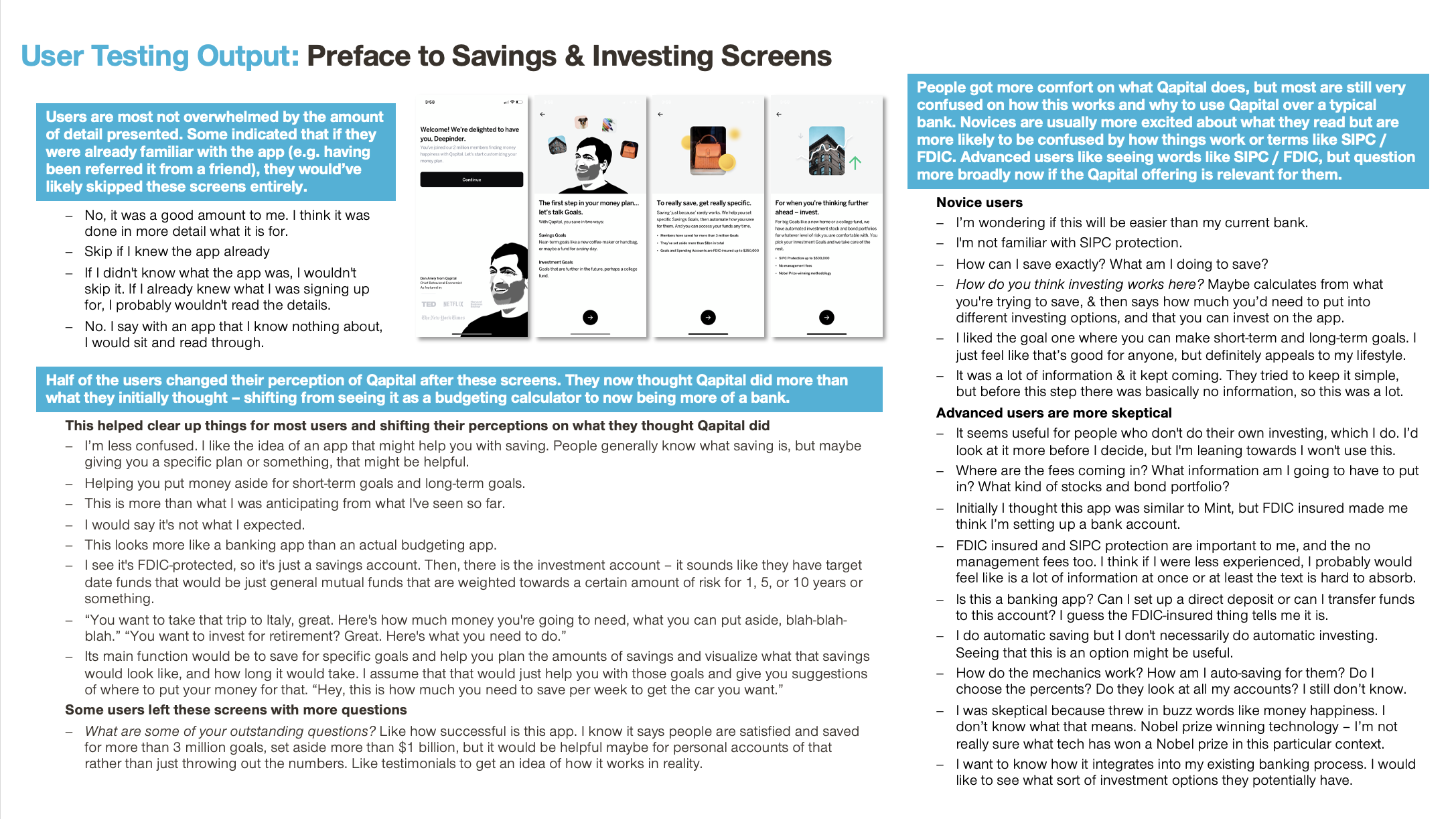
Qualitative research from Simon & Kucher
Based on these findings, we decided that our new onboarding needed to find a way to make information-gathering and decision-making, on the user’s end, to be more piecemeal. Going forward, we wanted to apply a “bite-sized” approach to onboarding, rather than trying to cram a fifteen-course meal down the user’s throat in one sitting.
New onboarding strategy
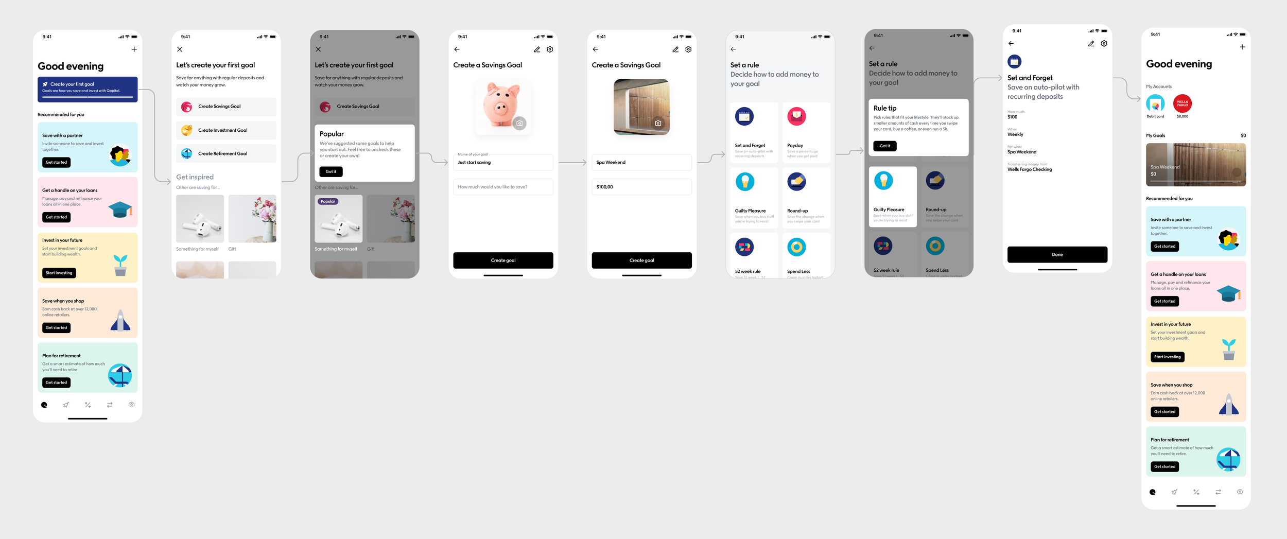
First and foremost, we wanted to reduce the number of screens. By condensing information into pop-ups and tooltips, we found that we could cut a lot of screens that were dedicated to conveying one single idea. This helps reduce the amount of tapping (and thinking!) the user has to do.
Below is an example of the new onboarding, using modals to show the value of features such as Goals and Rules.
By using progressive disclosure, we ease the cognitive burden on the user and allow them to digest information one bit at a time. Because our app contains so many different features that pertain to an overall vision of financial health, it becomes cumbersome to dedicate 1-2 screens to each feature. Instead, we have small moments to highlight the user benefit that each feature can provide.
By applying this "bite-sized" approach to our onboarding, we saw gains in our completion rate—from less than 20% to about 50%.
Onboarding carousel
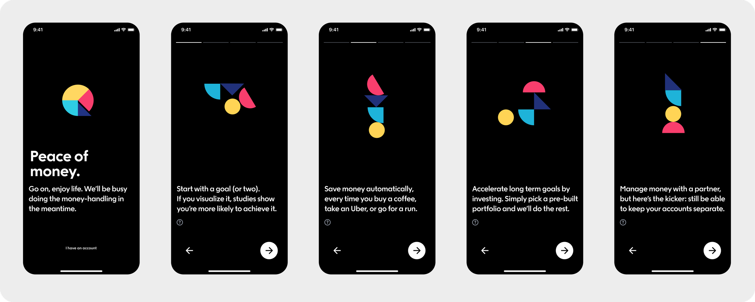
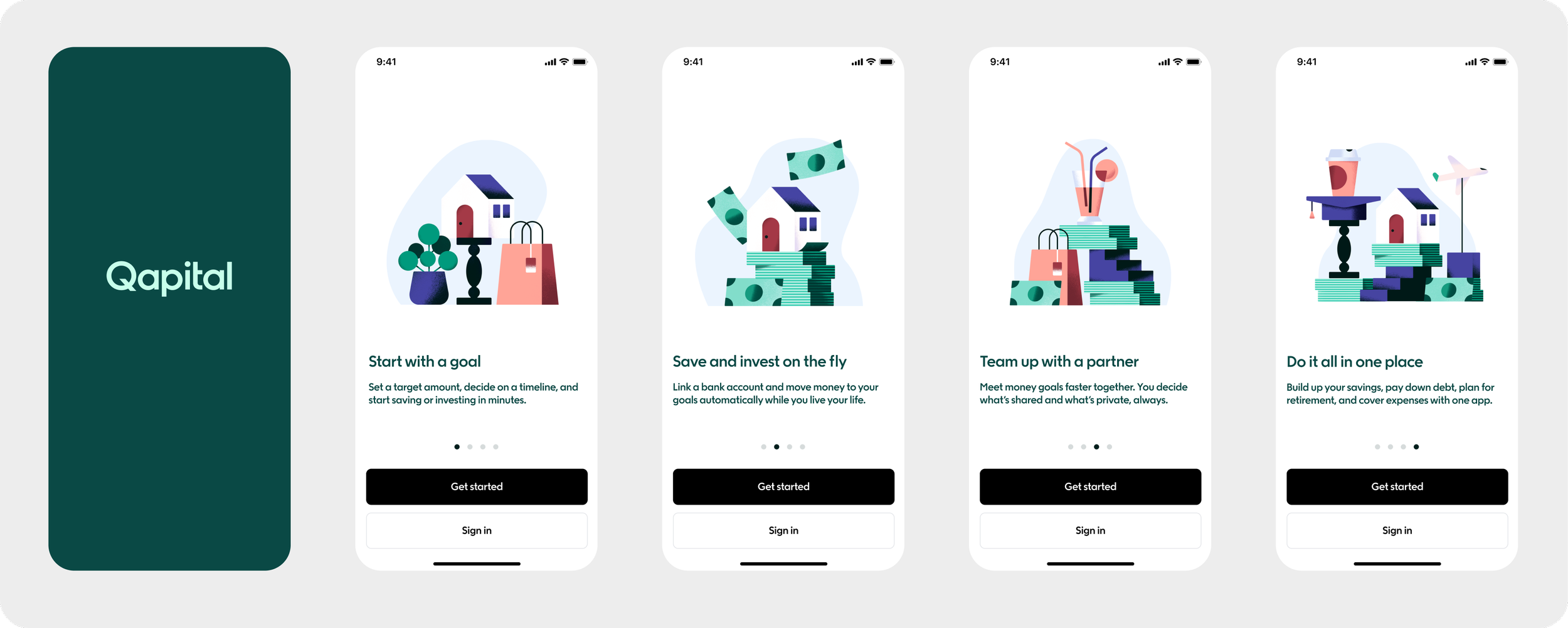
Since the onboarding carousel acts as the first touchpoint with the user after they download our app, it’s important to use it wisely. My ambition was to describe what Qapital does and what it can offer, but furthermore, establish a trustworthy tone of voice that will encourage the user to keep tapping. I worked with the design team to create countless iterations of this carousel, with designs differing from animations, to photography, to app UI, and to illustrations. The words changed too, and with each iteration we tried to make them scannable and easy to digest, since most people would probably flip rapidly through these screens. Below is an earlier iteration of the carousel, with a punchier voice meant to stand out.
Upon further iteration, I decided to go with something a little bit shorter, and with clearer value props. By keeping the headers to 5-6 words, it’s easy for a user flipping through these screens to quickly scan the headlines and know what they’ll be able to get out of Qapital.
