Dream Team
Qapital Dream Team™ helps users team up with a partner to save towards goals together. What makes Dream Team stand out is that it gives couples the feel of joint finances without actually combining accounts. Couples can put money towards a goal, but at the end of the day, the amount they contribute stays theirs.
Developing
Dream Team
To give you a better look at Dream Team, here are some slides from the Press Kit that give you the gist of how it works. I helped write and design the slides.
Dream Team is a huge feature, so for the sake of time I won’t be showing how the entirety of it works, but rather a few interactions that I led the design on.
Onboarding carousel
I also iterated on creative, concise ways to explain Dream Team features during the onboarding carousel for the product. I wanted to find a way to make the value propositions easily digestible and quick to read. Since this is such a complicated product with so many different functionalities (such as P2P transfers, separate but joint accounts, commenting within the app, etc.), finding a way to explain Dream Team in a matter of a few words was a harder challenge than expected. I worked with a designer to develop this onboarding carousel concept, and we brainstormed together on themes/metaphors that could explain the product well, but at the same time, make it less tech-y and finance-y. Eventually, we came up with basketball as a concept to illustrate the product’s main value props in a diverting, easy-to-understand way.
After some deliberation with stakeholders, they wanted the onboarding carousel to showcase more UI from the app and to have a bit more description on how the feature actually works. After iterating, we landed on this design and content:
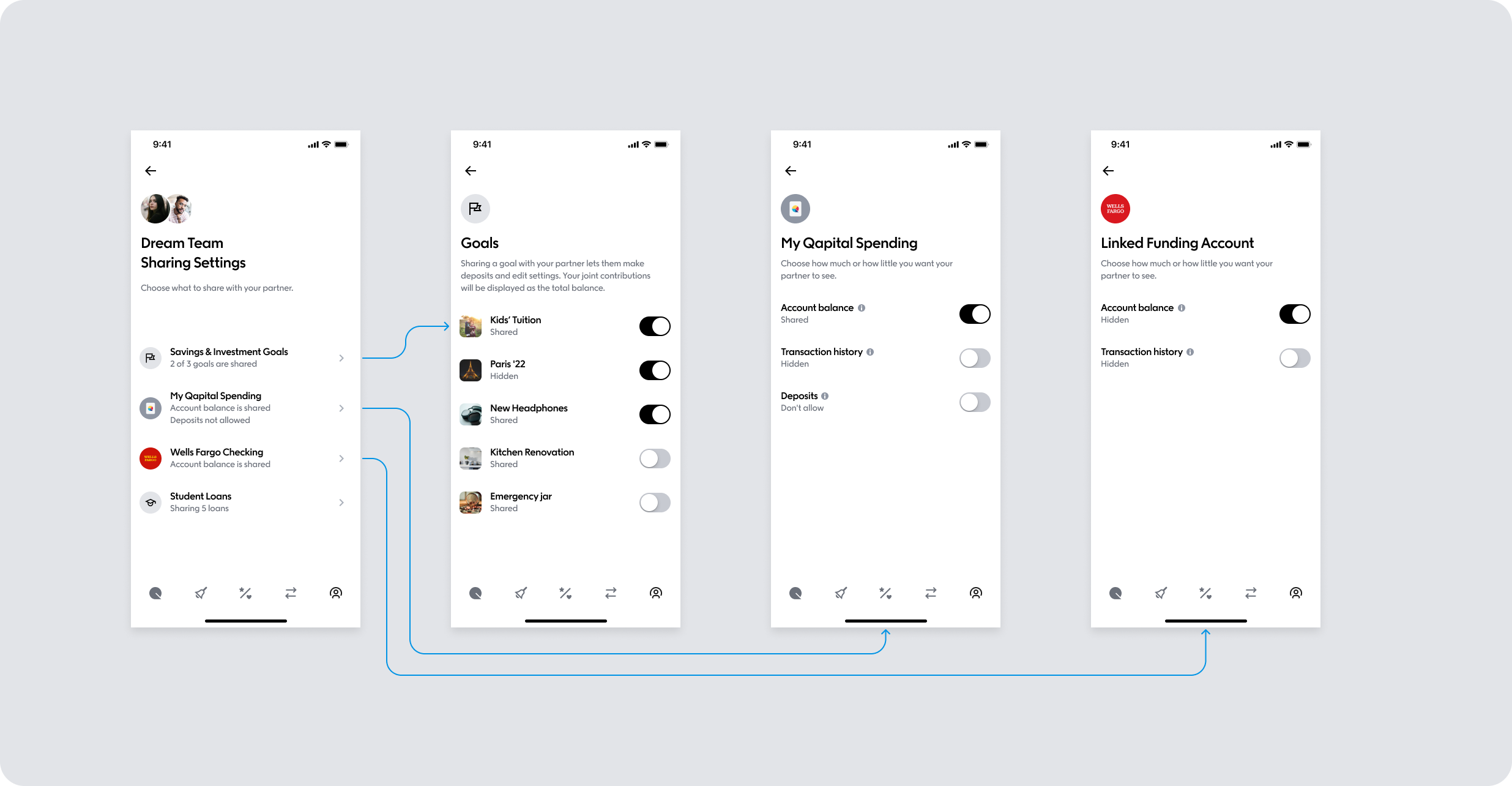
Improving information architecture of Settings
A few months after launching Dream Team, we saw that a lot of user dropoff was happening on the Settings page, where the user decides what goals and accounts they want to share with their partner. In order to reduce friction, I paired with a designer to rethink the information architecture of this Settings page. We took it from all living on one lengthy screen to creating an accordion-like experience.
Left: settings page before, as one long screen with lots of toggles.
Right: settings page after, an accordion system where users can edit settings by category.
Cashout experience
At outset, when a couple would reach a goal and want to cash out their contributions, each person could only take out the original amount of money they put in. As time went on, we began to consider certain cases in which one user would want to take out all of the money in the goal, for example, if a person wanted to book a hotel room for a trip but needed the full amount of their “Weekend in Rome” goal to do so.
Adding a Duo functionality
A few months after launching Dream Team, we wanted to find a way that would increase the amount of users enrolling in the feature. We settled on creating a duo payment plan, similar to that of Spotify, in which one user could pay for two memberships for a discounted price. Not only did this sign more people up for Dream Team (because the user who is being paid for gets a free membership, reducing a lot of the friction that comes with going through LFA, tier pricing, etc.), but also an added benefit of increasing user sign ups for the app in general.
We added two simple screens that gave the person creating the Dream Team the option to pay for their partner. However, our legal team gave many requirements of what needed to be included here. After some back and forth, and ultimately some negotiation on behalf of the user, I was able to create a screen that was clear and concise, but still included all the most necessary info. Below you can see the progress of going from lengthy/wordy to short/sweet.


